Friday 15 April 2016
Thursday 14 April 2016

Wednesday 13 April 2016


Tuesday 12 April 2016


Sunday 10 April 2016


Saturday 2 April 2016
Evaluation Q7
Looking back at your preliminary task (the school magazine task), what do you feel you have learnt in the progression from it to full product?


Mise en scene and camera work: Looking back to the magazine i produced for my preliminary task and comparing this to my end media product, i have made vast amounts of progress. In terms of mise en scene and camera work the quality of the images is greater, despite using the same camera. This is evident with all photos on my preliminary task, consisting of the same angle. This is different in my final product as i have learnt that in order to attract my audience there must be a range of shots with different angles for each. Regarding the setting or background of the photos i have too learnt that a range of settings and backgrounds also is important if the products target audience is to be attracted and their attention held within aspects of the product.
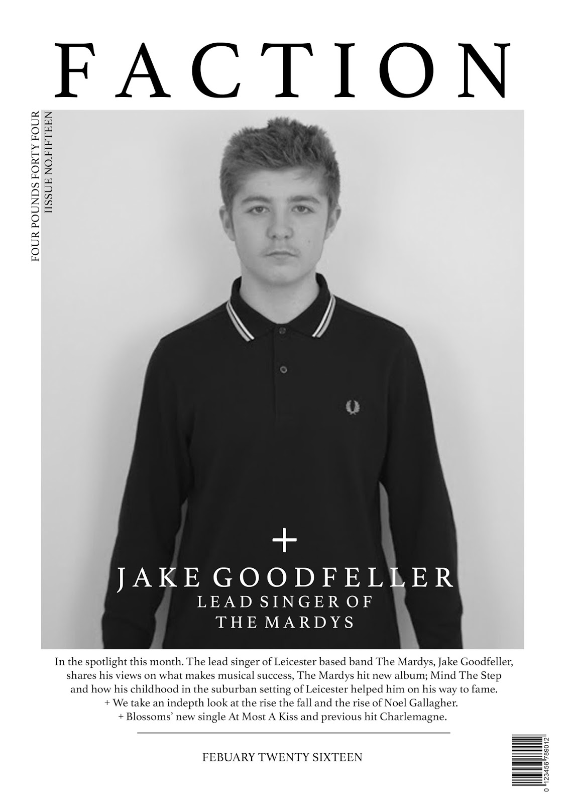
As well as setting and angles, another aspect of shot composition of which i have learnt a great deal about is the styling of the models used in the photos. With my preliminary task asking me to produce a school magazine, the styling of my models was not considered and resulted in the photos not linking to the magazine subject. However through the feedback i received from the task i was able to amend this problem for my final media product. By then styling my models in clothing linked to my music genre (indie/alternative rock) it allowed my magazine to look professional as links could be made from the models to the subject. For example on the front cover of my preliminary magazine it shows a mid shot of a 17 year old male wearing a long sleeve Paul Smith polo, this is not a piece of clothing that is relevant to the subject of the magazine, which was school. The model used is also holding his arms out. This too has no apparent link to the magazine subject and therefore creates a disjointed, confusing front cover. With the mistakes i made in the preliminary task and what i learned from them, i was able to create a relevant front cover image for my final product, this shows my featured artist with his hands by his sides in a Fred Perry polo, this links in with the subject as the clothing brand is sported by other indie/alternative rock artists and also by the audience of the product.
Away from mise en scene, my camera skills have developed vastly. The framing of my images in my preliminary task were mostly central, however using the rule of thirds in the creation of my final product i was able to stray from the normal centrally framed shot and challenge conventions whilst still achieving the shots that i sought after. Also as time progressed and i was getting used to the settings on the camera i learnt about exposure, a camera setting that changes the shutter speed corresponding to light. This was a valuable piece of knowledge that aided me when taking photos in settings of different light levels. For example the exposure i used whilst taking my contents page image and the second photograph of Jake Goodfeller was faster, this allowed me to capture the shot with more detail. Whilst inside the darker lit studio i was able to set a slower exposure to achieve the same effect. Equally as important as the knowledge i gained regarding the camera settings, i gained knowledge on shadows, by manipulating the light source in the studio i was able to capture images with either no shadows or the right level of shadows to create a certain mood in the photo. This is an understanding that i did not have in my preliminary task.


Design: In my preliminary magazine i used a similar, minimalistic, style to my final product. However i feel with the preliminary task in did not fully understand the design concepts of a magazine. I feel this is apparent with the text sizing on both my front cover and contents page. This was amended in my final product as i received feedback on the preliminary magazine that highlighted the text size as an issue. The font i used for my preliminary task was a pre-set font, i used this font as it was a typical magazine font, however i did not consider the impact it would have on the audience. Whereas in my final product, with the research i carried out on my audience on UK Tribes and also my research on the lexical register that i would use in my magazine, i tried to find a specific font that matched the lexical register and would appeal to my audience. During the process i learnt that finding a magazine that has an audience with a similar audience can be beneficial when trying to understand about the conventions of a magazine with a similar genre. This is something i did with Fantastic Man, a fashion magazine, i felt that the magazine's audience will care greatly about personal image, something which after carrying out research understood my magazine audience to also care about. This is a method that i did not use when constructing my preliminary magazine and i feel that subsequently resulted in the poor choice of font.
Regarding the design and placement of imagery, i feel my skills have too greatly improved.During my 'prelim' construction i did not carry out any research into how contents pages are set out, which lead to be producing an unconventional and aesthetically poor, centralised design consisting of only 3 images and a small amount of text describing the article and the corresponding page. However with the design of my final product my Photoshop skills were developing that helped me, alongside research into not only contents page layouts, but front cover and double page spread designs, as i adopted a similar and effective layout of Clash Magazine.
Subscribe to:
Posts (Atom)